The Forgotten Birds: A Study of the Baltimore Orioles Cartoon Bird Cap Logos
My favorite team, The Baltimore Orioles! They haven’t had a winning season since 1997, so lately I’ve shifted my attention to my favorite logo of all time, The Cartoon Bird. That friendly, smiling, feathered chap that perched atop the Orioles caps from 1966-1988. But don’t let his friendly smirk and soft feathers fool you, he will show no mercy.
The Cartoon Bird logo has 19 out of 23 winning seasons. That includes 7 trips to the ALCS, 6 pennants and 3 World Series championships. Not to mention, the Orioles were the winningest team in all of baseball during that span.
Here’s a good visual breakdown:
OK, enough with Baltimore’s long gone winning baseball history, lets get to the actual cap and its famous logo:
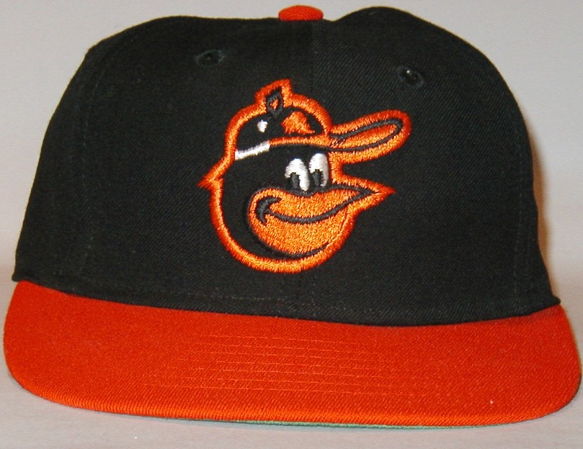
First the 1966-1974 cap:
This is a Mike Cuellar game-used cap, made by Wilson (Wilson caps were manufactured by New Era).
Here’s a ’74 Topps Paul Blair card wearing the same cap:
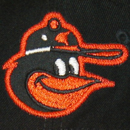
The logo above is the most commonly seen on caps from that era, however, other logos have shown up on this cap:
This is Mark Belanger’s cap. I haven’t seen any pictures of actual players wearing this cap. The subtle differences between the two logos might be because this one was made by the KM Pro Cap Company, but both Wilson and KM Pro apparently had their embroidery supplied under private label by The Roman Art Embroidery Corp., so who knows?
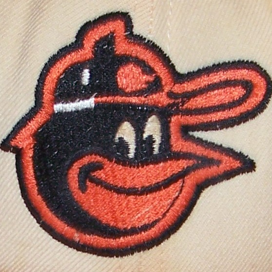
And here’s yet another variation:
Made by Wilson, this is 1st base coach George Staller’s game used cap from 1970. I’ve never seen any cards or pictures from ’66-’74 with this logo either.
Here’s one more variation of the Cartoon Logo on the black crowned cap:
Also made by Wilson, it’s another Mike Cullar game used. I’ve seen this version of the bird on pictures of the Orioles from 1974.
You can see it on this Jim Palmer card from the 1975 Topps set. The O’s had made the switch to the white panel caps in ’75, so the actual picture was most likely taken during the ’74 season or maybe ’75 Spring Training:
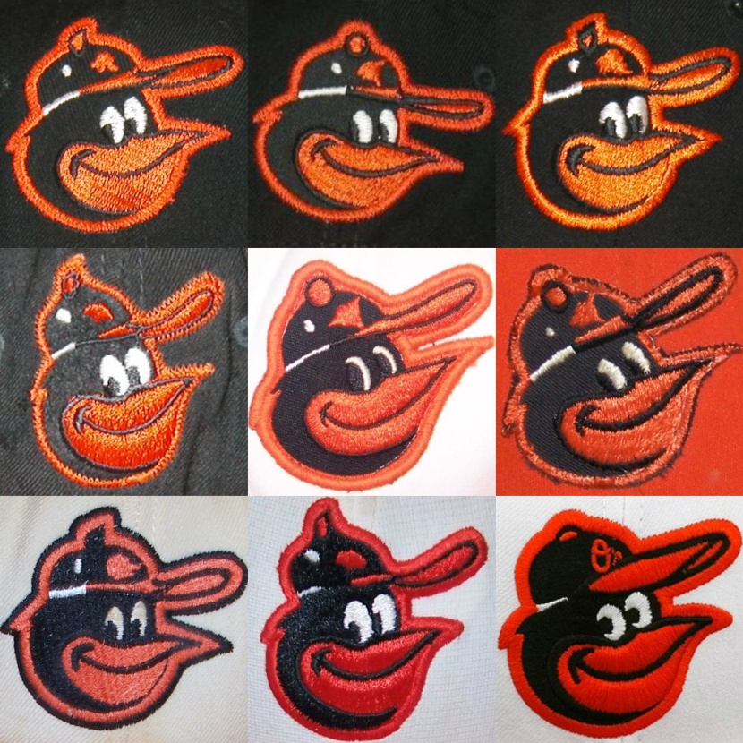
So here we have 4 distinct, different versions of the Cartoon Bird on the ’66-’74 cap:
(Click here for what may be the very first Cartoon Bird cap logo.)
All of ’66-’74 game-used caps I’ve come across have been made by Wilson, but then there’s that one I found from KM Pro.
I’d like to know exactly when Wilson and KM Pro had the rights to manufacture Orioles hats during these years, and whether or not they were exclusive back then.
Moving on to 1975, the Orioles added white panels to the front of their hat:
Notice the black stitching around the white panel. Also, if you look closely at the logo, you’ll realize that it’s basically an enhanced version of the logo on the black crowned ’74 cap. This logo is bigger overall, the features are slightly larger and the whole thing is angled up more, making his beak point higher. Made of 100% Nylon, these were manufactured by the AJD Cap Company, based at the time in Richmond, Virginia.
The one and only Brooks Robinson:
They also had an alternate orange paneled cap that they used through 1976, with a similar logo design:
This is Tommy Harper’s 1976 game-used cap, also made by AJD.
Slightly smaller than the previous logo, this logo was also featured on the white panel caps. In fact, it’s the same exact logo design as the ’74 logo with a black outline added.
Here’s Reggie Jackson sporting it in 1976:
And here’s another variation of the same cap with the larger logo and a black button on top:
Looking at these logos side by side, you can see that they’re all basically the same design:
Going by my Topps baseball card references, these two logos would stay on the white paneled cap on through to about 1978.
Here’s another cap that also shows up in about ’78:
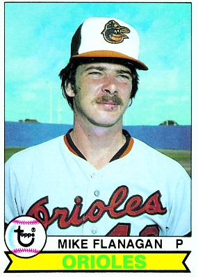
This is a Doug DeCinces game-used from 1978. Notice that this logo is the same as the KM Pro logo from above, but the button on the birds cap is black instead of orange, and the whole head is outlined in black. The similarities between these two logos make sense because this cap is made by the Roman Pro Cap Company (the former embroidery company mentioned above). They began manufacturing their own caps when KM Pro went out of business.
Here’s Mike Flanagan wearing that cap from the 1979 Topps set:
As I mentioned earlier, the photographs for the Topps cards back then were usually taken the previous year, or during Spring Training of the same year, so I assume they used this hat in 1978.
Around 1979, the Orioles switched to this cap by New Era:
This is Cal Ripken’s cap. It’s made of Nylon, with clear nylon stitching, however, it’s a much thicker weave than the AJD caps above, which were also made with Nylon.
Here’s Cal wearing it on his 1987 Topps card:
This cap was worn through the 1988 season. This would be the final Cartoon Bird hat, before they switched to the ornithologically correct Oriole logo in 1989.
Notice that it’s the same logo that’s on George Staller’s 1970 cap, above.
Here are all the logos featured on the paneled caps:
Again, it would help to know exactly when AJD, Roman Pro, and New Era were contracted to make caps for the Orioles during this time, because there seems to be overlap for some years, so it gets a little confusing trying to figure out the exact chronology.
This is the best I can come up with from what I know for sure:
Top-Bottom, L-R:
- 1966-1974 – This is the logo you see most often on the black crowned caps. I think it’s pretty safe to call this one THE ’66-’74 cap logo. Made by Wilson.
- 1974 – This logo seems to show up on the last year of the black crowned caps in ’74. This same basic design would remain on the caps through the transition to the white and orange panels. Also made by Wilson.
- 1975-1978 – Logo used on both white and orange panel (’75-’76 only) alternate. Made by AJD.
- 1975-1976 – Logo used on both white and orange panel (’75-’76 only) alternate. Made by AJD.
- 1977-1978 – Made by Roman Pro.
- 1979-1988 – Made by New Era.
I’m just not sure where these other two black crown logos would fit in:
I have yet to find any photographs of players wearing these. Could they have been prototypes or samples of some sort, given out in limited supply?
Here are all the logos together again, for easier comparison:
Except for the top and bottom left, all the logos basically match up with each other.
Who knew there were at least 4 different, distinct variations of this guy over the years?! I think it’s interesting that all the versions appeared at one time or another on the 1966-1974 black crowned cap, and 3 of the 4 were made by the same manufacturer, canceling out the possibility that the variations were caused by switching companies.
Now, the reason I titled this The Forgotten Birds, is because the only bird people seem to remember nowadays, (if they even realized there were differences in the first place) is the ’79-’88 bird. All throwback merchandise today only features variations of that particular bird.
For example, here are the best “replica” caps offered at the moment:
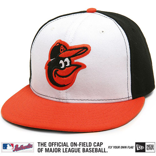
First, New Era’s Authentic On-Field, Turn Back the Clock cap, released earlier this season:
And here are the best white and orange panel New Era Cooperstown Collection caps:
They all look like decent caps, but if you’re a stickler for detail, like me, you’ll see that they all have the wrong logos.
Even the white paneled cap, which is almost correct, (for ’79-’88) isn’t exact. Look at the logos side by side, original on left, replica (featured on all 3 caps) on right:
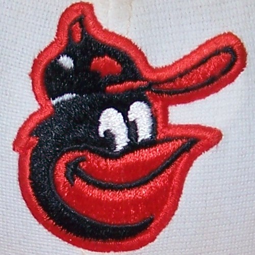
Some might really consider this nitpicking to the extreme, but the replica logo on the right, while the embroidery is more refined, isn’t quite as round and symmetrical as the original, particularly the line along the bottom left. Other minor differences include the button on his cap and the eyes.
Even Chris Creamer’s authoritative sportslogos.net doesn’t have the correct logos:
(The ’66 logo is very close to the actual logo. The only difference I can notice is the button on top of his cap. See above for the inaccuracies in the other two logos )
At the very least, these four logos should be represented:
Here are the graphic versions:
Well, that’s pretty much everything I know about the Baltimore Orioles Cartoon Bird cap logos. The Orioles are bringing back a new version of him on their home and road caps for the 2012 season. While I haven’t seen it yet, the new version of the Cartoon Bird is reported to be a combination of these two guys:
The unveiling should be later this month, and I can’t wait! I, for one, am glad to hear that they are designing a new logo, that fits in with the old logos, rather than use an old version that isn’t exactly correct, like they do with the Cooperstown Collection and TBTC “replica” caps, as I’ve pointed out above.
UPDATE:
It’s been 23 (mostly losing) seasons of this:
1989-2011 Ornithologically Correct Bird cap logos
I’ve never particularly had a problem with the different variations of the realistic bird cap logos. When it was introduced, the Orioles had just been through a few losing seasons, including their worst in 1988, so I think at the time, (1989) putting a new version of the realistic bird on their caps was a refreshing change. That’s right around the time I started seriously following baseball and I remember being very excited about that hat. In fact, it was my first authentic, on-field cap. I think that cap logo also fit in well with the Birds moving to Camden Yards in ’92.
That said, if the realistic bird ever makes its way back onto the caps again, I think it should be as an alternate only. The Cartoon Bird has proven himself as THE classic Orioles logo. I’m glad to see him back, and hope he’s here to stay!
First the new home cap:
Who would have thought that the Orioles would not only bring back the Cartoon Bird, but the ’75-’88 white panel too! Bonus! The white panel cap is a unique look to current day MLB cap styles, and now that the Orioles are the only team sporting them, I think they really have a chance to own this look!
The new logo looks even better in its raised, embroidered form:
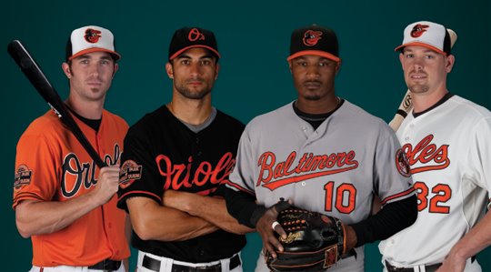
Here are Mark Reynolds and J.J. Hardy, proudly wearing their new caps:
The new road cap:
Reminiscent of the ’66-’74 caps.
Adam Jones, stylin’:
Of course I’m biased, but this has got to be the best looking uniform set in MLB right now!
They even brought back their orange alternate jersey! Double bonus!
Here are each of the known variations of the Cartoon Bird for chronological comparison:
The new logo really fits in perfectly with the past logos.
And here’s the entire Cartoon Bird family!
Here are all the variations in graphic form, including a ’66 rarity and the ’66-’88 helmet logo:
Please drop me a line for comments or if you can add any more information.
Click here for my brief article about the Orioles Cartoon Bird helmet logos.
Click here for a recently discovered Orioles Cartoon Bird cap logo.
SPECIAL THANKS TO:
Parkway Pastimes – Awesome Orioles collection, where I found most of the game-used cap images posted above.
Ryan Sullivan of pasteinplace.com for providing his “Lucky Bird” analysis chart.
Matt Strackbein – Graphic Design, Production Artist, Comic Book Creator – For converting the photographed logos into graphic images.
Click here for a brief article about converting the logos to graphic images.
The Ballcap Blog Where I found information about the different cap companies.
Neal, for providing “The Bird Is Back” banner.
Clint Farrell of www.ProCapRepair.com, for providing pics of his absolutely pristine AJD caps.
All information written and compiled by T.L.Lears 2011















This is great! Any idea how closely the helmet logos match the hat logos throughout this period?
Thanks Special-K. I’ll be posting a short blog about the helmets soon.
Awesome, thanks man!
When will the “fashion show” be? Thanks..
Mike
Don’t have an exact date, but I’ve heard it’s supposed to be sometime this month.
November 15th is the date, according to this twitter.
Fantastic look at all the variations – I love the pictures showing them all side by side. Thanks for doing this great research to show the many subtle differences over the years. Can’t wait to see the bird back on the caps next year!
Thanks, Fleerfan. Spent some time looking through your blog today. Great stuff!
Check it out.
Great artical,love that cartoon logo. Any information on the logo that was on the helmet over the same period? Didnt really match with the hat logo. Were they painted on with stencil or was it decal material? Who did the helmet logos, maybe the club hired an artist or the equipment manager was responsible? Also love the 1964 and 65 logo. Would prefer the club bring back that uniform, so clean and classic.
Thanks Jeff! Click this link for the helmet logos.
I have a many Baltimore Colts helmets and game used items from the 1960’s but have not seen or know of anyone that has Orioles game used helmets from that period. Do you know of anyone that might have a collection of Colts or Orioles gamer items?
See my “Special Thanks” section at the end of the article.
I’ve been saying for years that the Orioles need to got back to the old logo. It seems like there’s a “Curse of the Silly Cartoon Bird” going on, but actually not having a great pitching rotation like in the past is the real culprit.
You know, I never thought of a “Cartoon Bird Curse”, but you might have something there! Here’s the breakdown:
1954-1965 correct bird caps: 942-943, 5 of 12 winning seasons, no playoffs, no World Series.
1966-1988 CARTOON bird caps: 2030-1614, 19 of 23 winning seasons, 7 playoffs, 6 pennants, 3 World Series Championships!
1989-2011 correct bird caps: 1714-1941, 6 of 23 winning seasons, 2 playoffs 0 World Series.
This article rocks! I always thought that I was the only person on the planet who cared about things like this. Despite my love for the Orioles and the cartoon bird, I never realized how different the logos were. Truly fascinating research even if it only fascinating to obsessed and devoted Oriole fans like us!! Go birds in 2012!!!! Love ya black and orange!!!
Thanks for the article! I grew up in Baltimore in the 60’s and remember well the golden years of the Orioles. I agree the cartoon bird is the best ever and am glad they are returning to their roots. I was a Junior Oriole at one point and have many great memories of Memorial Stadium. I certainly love Camden Yards, but there was some special magic in that old building.
TL, thanks for the great review. I am getting a tattoo of the new logo on the outside of my left thigh, which would mean that the bird is looking back rather than forward. Is it sacrIlegious to to use a mirror image so that the bird looks forward, with an appropriate re-orientation of the “O’s” on the hat? And what about outlining the logo in a thin black line similar to the 1978 DeCinces hat you picture? If anyone knows the subject matter, it would definitely be you. Thanks
Go for it! And send a pic when it’s done!
I just found your terrific article. I remembered seeing different birds on the hats over the years, and I truly appreciate your attention to detail. Those Cooperstown hats with the wrong logo drive me crazy! Just wanted to mention that around 1990 Roman made a 1966-74 black crown replica (see http://ballcapblog.blogspot.com/2010/08/classic-roman-pro-cap-company.html), but they put their 1978 bird on it (the bird with the black button). So it was wrong too, since the 1978 bird was only on a white panel cap.
New Era’s Cooperstown Collection cap actually has the correct logo; it was used around 1979-81. Here is Jim Palmer’s cap from about 1980, http://www.parkwaypastimes.com/item.php?id=306. When all-nylon caps came out, around 1982, the final logo was introduced and was used through 1988.
Yeah, I realize it’s basically the same logo, it’s just if you look at my example of them side by side, while very close, the Cooperstown logo is not exactly the same. (I know I’m being super nitpicky here!)
The logo on the Jim Palmer cap in your link looks the same to me as the logo on Cal Ripken’s Nylon cap, posted above. What do you mean by the final logo used through ’88? I thought these were it?
It’s interesting to know that the Orioles New Era, all-Nylon caps came out in about ’82. Do you know what they were made with before that? Incidentally, I recently came across an Earl Weaver New Era game-used cap with the same logo and the material appeared to be the same type of Nylon as Cal’s cap, but it was an all black crown!
Thanks for the info!
Check the gravatar. Tattoo is healed and looks great to me, at just under 5″ tall on the right thigh looking forward! Ironically I am in Boston this week for work, with temps in the 80’s , but will stick with jeans. They really seem unsure of their team team this year. Still upset over the outcome of the final day of the 2011 season, no doubt. Boston is my choice for O’s biggest rival just because of their obnoxious fans…wore than the Yankees and even the Phillies!
That’s an awesome tattoo, and totally agree about Boston!
Awesome article … I grew up in Hawaii, but got imprinted with the Orioles because the first “live” football game I ever saw was the season opener between the Packers and the Unitas-led Colts in 1966. It was televised live to Honolulu, and my Dad and I skipped church to watch it … he was a huge Packers fan. I knew nothing about the teams, but I kind of liked the funny little “U” on the the white helmet of the “other” team, so arbitrarily I decided to cheer for them. The Packers won the game, but my lifetime love affair with the Colts had begun. Not a baseball fan at all, a few weeks later I happened to be in my 5th grade classroom and some kid had brought in his little transistor radio. He was listening to some baseball game. A lot of other kids were huddled around it also, and when I heard the word “Baltimore”, my ears immediately perked up. It turned out to be a World Series game between the Dodgers and Orioles, and thus began my lifetime love affair with the Orioles. I soon completed the Hat Trick when I discovered Earl “the Pearl” and Wes Unseld and the Bullets. I was growing up in Hawaii, but cheering “anything Baltimore”. I became obsessed with the Orioles, and our family (my mother was from Connecticut, father from island of Kauai, HI) would take an East Coast trip every 5 years. So my Dad made it a point to visit Baltimore for me, and we visited Memorial Stadium when the O’s were out of town. I took a photo of the huge “Year of the Bird” cartoon banner on the front of the stadium, and recreated it as a poster on my bedroom wall back home. I’m still the biggest O’s fan ever from the middle of the Pacific. Totally relate to all of your article … I’ve obsessively worn O’s caps for years. Mahalo’s !!!
What great memories, thanks for sharing. Aloha!
I was inspired by your article and decided to take a look at some stats based on which bird was worn: http://www.flickr.com/photos/pasteinplace/7153272177/in/photostream
Ryan, that is fantastic! If things keep going the way they are, I have a feeling the Cartoon Bird’s stats will be further improved upon this year! (fingers crossed!!)
Ryan,
What are the W/L stats for each of the 0’s hat logo’s, do you know?
Undoubtedly, Cartoon Versions will be on top, but this is probably an indirect corelation. It would be interesting to do some data-mining to find out if there are any direct corelations to results.
[I still hold to my pre-season hopes…82 wins and ruin any Red Sox chances. When (if, we reach Goal #1) I will raise expectations and start checking the standings for the season for the first time.]
Why Not?
I Actually bought one of the KM pro Orioles caps at the factory in Boston in 1970 Where I saw old ladies making caps on sewing machines
Wow… wonder which version of the the logo they were using?!
I was told by the owner they made the caps for all major teams except Houston. Was it a little whitd lie? I still have the cap. I was a big Orioles fan as a kid
Don’t see why it would be a lie. It seems the Orioles had at least a few different companies providing their caps from back then. Certain cap companies seem to be more common than others, but there didn’t seem to be any concrete exclusivity. I’d love to see your cap, what variation of the logo did it have on it?
Hi Dave, It has the same version noted on the KM Pro hat shown in the text of this blog
I can send you a picture if you can get me youe email
Thanks so much for the time taken to document the O’s caps. Really LOVE the cartoon bird cap and had a somewhat dislike for the realistic bird. I even liked the earlier versions of the Oriole bird prior to ’66 than the ’89 – 2011 lifelike era (just my taste). Have you documented the ’54 to ’65 styles? Those are some pretty cool birds as well…I even liked the “B” hat.
Thanks Mark! Haven’t documented the ’54 – ’65 caps. Don’t really have anything against them, just not as interesting to me as the cartoon logos.
Here’s a pretty cool video from MASN by Tom Davis that goes over the O’s cap history. You can see the early caps, but note that he doesn’t include all of the Cartoon Bird caps:
http://www.masnsports.com/ml/video.php?show_id=40418
Thank you for being so thorough in your post! Have you ever come across the name of the illustrator or ad agency responsible for drawing the original Cartoon Bird (1966)? I know Stan Walsh is credited for drawing the bat-swinging bird (’66) and Peacock Bird (’67), but it doesn’t look like his artwork for the bird’s head itself. Have you seen any credits for this?
Hi Mark,
I’ve tried to get info from the Baltimore Orioles about this, but to no avail. I also once came across the website of the artist that designed the “Baby Bird”,
which was used for youth oriented programs, as well as a jersey shoulder patch for a short time. I emailed the guy for any info he might have, but no luck there either.
I’ve reached out to them as well. The logo history page on Orioles.com (http://baltimore.orioles.mlb.com/bal/history/uniforms_logos.jsp) credits Walsh as the creator of other well known cartoon mascots. I’ve since found articles citing different artists behind them all. I also found an account that an animator named Paul Carlson (who worked at Walsh’s company) actually drew the bat swinging bird. It may be a Don Draper/Mad Men scenario where Walsh was the pitchman that got the credit, but didn’t actually do the work.
That’s funny, I always imagined a Mad Men/Don Draper type scenario in the pitching of the Cartoon Bird cap logo to the Orioles back in ’66. Dramatic, mini curtain unveiling and all!
Years ago I was looking through one of my mom’s old comic books from the 60’s and noticed an ad for 7-Up that featured a bird cartoon character named Fresh-Up Freddie. I immediately noticed a resemblance between Freddie and the Oriole Cartoon Bird. Fast forward to a few months ago, Fresh-Up Freddie popped into my head for whatever reason, so I decided to Google him and came up with this site:
http://mrmagooschristmascarol.blogspot.com/2011/10/paul-carlson-production.html
Who created Fresh-up Freddie and illustrated the 7-Up adds? None other than Paul Carlson! This article also explains how Paul Carlson was asked to design the Orioles swinging Cartoon Bird logo while working for Stan Walsh’s firm. I’ve been meaning to put together an article about this, but I just felt I needed more info and confirmation that it was actually him.
Here’s one of those old 7-Up ad’s from the back of the comic book:
Good ‘ol Fresh Up Freddie, almost certainly a cousin of the Oriole’s Cartoon Bird!
I like the new logo. I think that It`s more simple and clean
Thanks so much for putting all this together. As a lifelong Orioles fan and a graphic designer I’m rather obsessed with the history of the logo. While I’m a huge fan of the return to the cartoon bird, there are few minor details I would change about it. I’ve actually designed my own version and I’m putting together a presentation to hopefully present to the O’s front office (probably sounds crazy, and maybe it is, but I’ve just got to do it!). Anyway, I was wondering if I could use some of the images and information you’ve chronicled here. Would that be alright?
I’d love to see your version of the logo and feel free to use whatever images you need from my posts!
Hello, This is really a great blog for the Orioles logo enthusiast like myself. My Father, Mike Zolotorow worked for the Orioles as Assistant Clubhouse Manager from 1976-1983. I own a game used example of the New Era orange front cartoon bird cap from 1977. contact me for photos.
Hello, This really is a great blog for Orioles logo enthusiasts like myself. My father, Mike, who passed in December, worked as Assistant (visiting, ’79-’83) Clubhouse Manager for the Orioles. I do own a Game used example of the orange paneled front cap produced by New Era from 1977. So the above replica is not entirely fiction. Contact me if anyone would like photos of the cap. Craig Zolotorow
Ok, now we need to focus on the Orioles logos created by the Baltimore Sun cartoonist Jim Hartzell. The bird on top of the baseball that has Orioles on it with the crossed bats is on of the best, but the Psycho Bird or Cuckoo Bird holding the tree trunk bat in anger is THE best. I would love to see these logos on caps much more often. They are one of a kind.
Yes, I’d love to eventually do an article on Jim Hartzell’s birds and those other cartoon logos. I’d also like to create a post about the cartoon bird shoulder patch, which preceded the cartoon cap logo by about ten years. Just need to gather some more information.
This is a great article. I am a lifelong Yankee fan, and do not like the present day Yankees cap. The KM Yankees cap was the best one. That being said, my favorite cap has always been the cartoon bird Orioles cap. I did not realize all the variations…as minor as they may be. I would live to know why the 1975- 1977 version had the beak tilted so high.
Hi Mark. That was just the Cartoon Bird holding his nose (beak) up to the opposing teams in smug superiority. Actually, the ’75 logo was a patch that was most likely placed by hand and stitched onto the cap with a sewing machine, hence the different beak positions. I’ve seen the beak on that cap pointing in multiple directions, from about level (3 o’clock), to nearly a 12 o’clock position! Most of them seem to be pointing about 2 o’clock though.
Take a look at these articles for more info on the ’75 cap:
https://cartoonbird.wordpress.com/2016/07/31/jump-back-75-orioles-ajd-cap/
https://cartoonbird.wordpress.com/2016/08/01/orioles-ajd-cap-restoration/